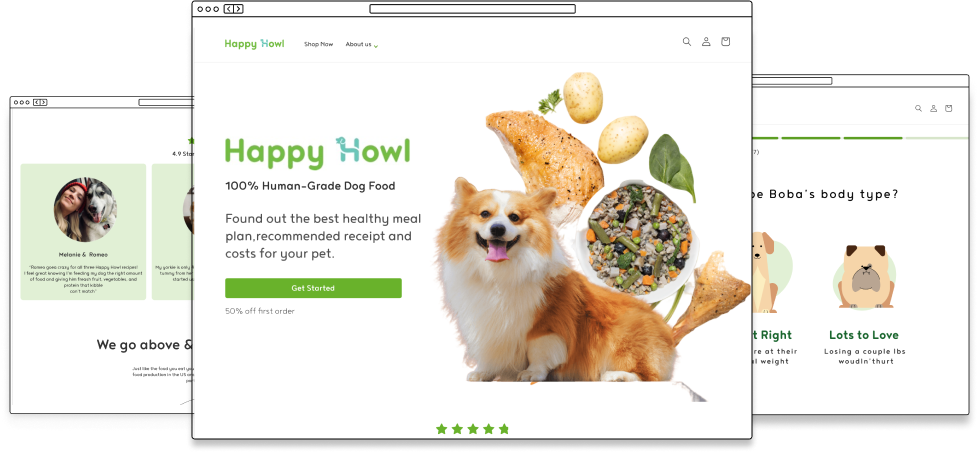
Enhancing E-commerce Website for Better User Conversion

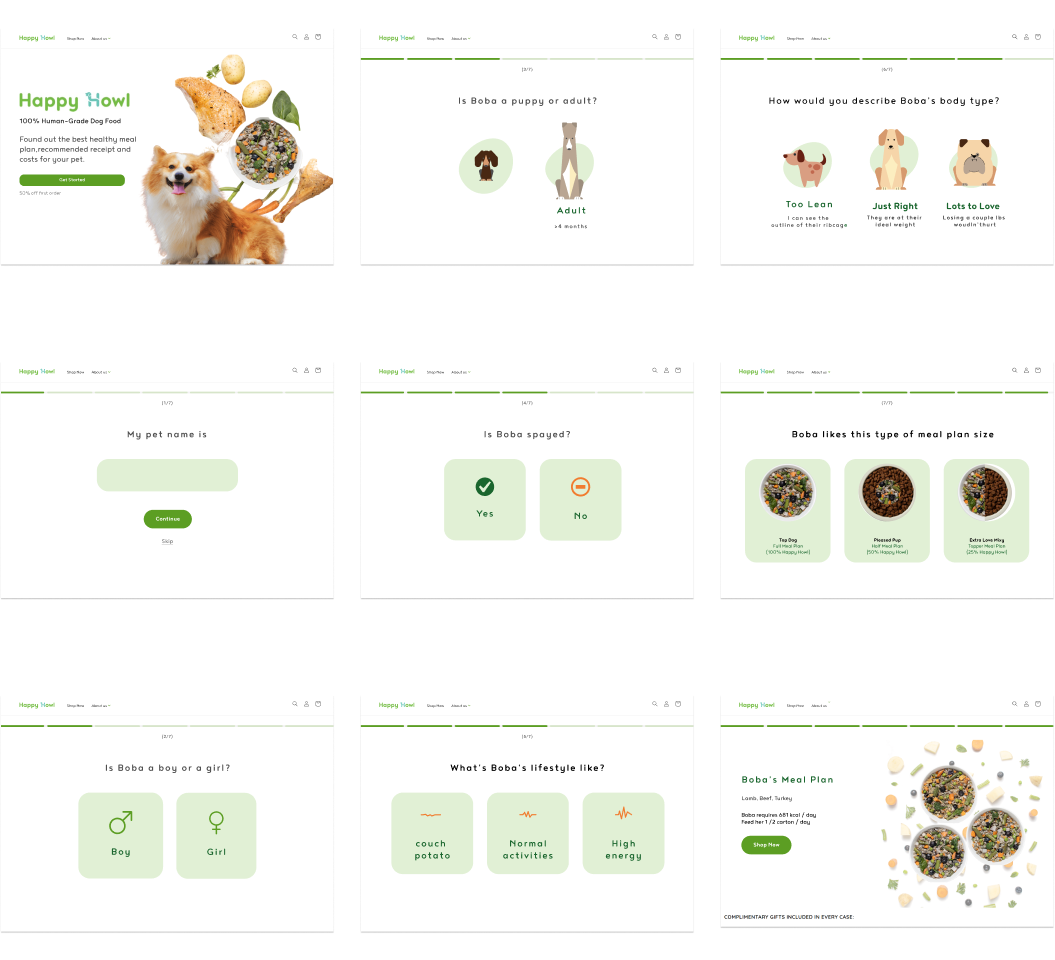
Happy Howl is a e-commerce website provide variety dog’s food, despite it sells good at the offline market, it did not covert the online visitor to their customer.

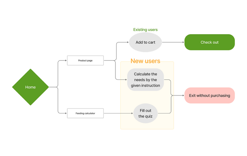
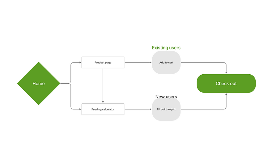
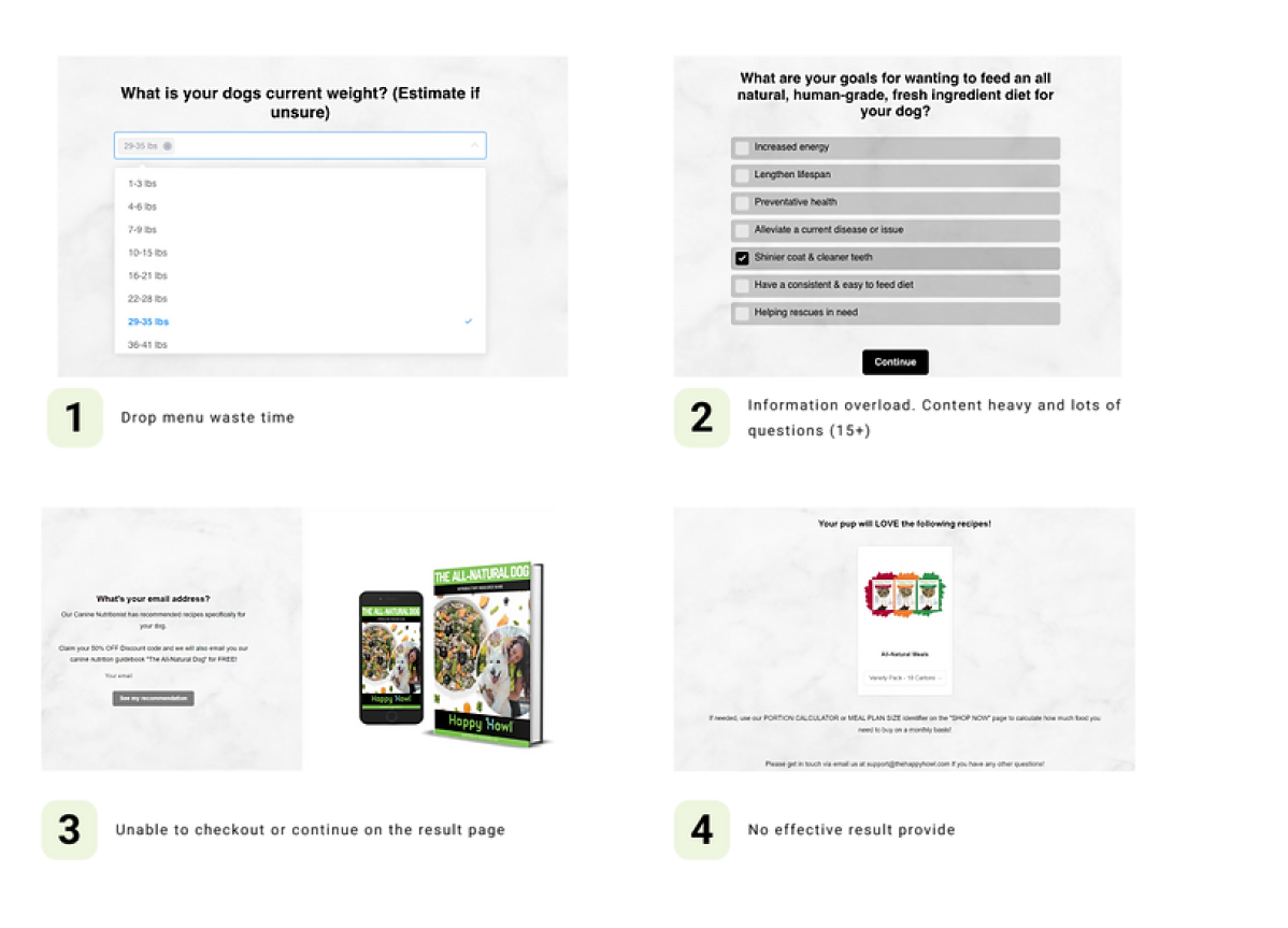
As a UX designer working with a startup team for one month, my responsibilities included collaborating the team in defining the overall UX strategy, conducting user research, performing usability testing, and validating the information architecture of the e-commerce platform to improve the user's experience and increase the conversion rate.

Optimizing the User Flow

The customers expect an easy checkout experience without spending too much time calculating the amount of dog food they need. However, the existing purchase experience was fragmented and inconsistent, leading to user frustration and low conversion rates.

After conducting user research, we discovered that existing users and new users have different purchasing behaviors. Existing users purchase directly from the product page, relying on their prior knowledge from the offline market. They do not primarily need the feeding calculator or instructions. Conversely, new users struggle with the online purchasing process, facing difficulties in calculating their needs. This led to a high bounce rate on the product page and feeding calculator, causing the shopping process to reach a dead end.

To address this, we reframed the user flow to allow existing users to purchase products without changing their routine, while enabling new users to check out smoothly. This required redesigning the individual feeding calculator and product instructions on the product page to be more intuitive.

Simplifying the Calculation

New users landing on the main page either start with the individual feeding calculator or browse the home page. However, the feeding calculator's complexity, with over 15 questions and numerous options, was bewildering and intimidating. Additionally, the lengthy process ended with a confusing newsletter subscription option.Users also struggled with the main page due to excessive text, large unrelated images, and jargon, making the information unclear and the page cluttered.

To eliminate friction, we analyzed competitors' websites to identify best practices. Using these insights, we redesigned the feeding calculator to increase efficiency and user engagement. We reduced the number of questions to a few crucial ones and added a progress indicator, allowing users to track their progress and return at any time. We also enhanced visual interaction with the user.

We simplified the home page by focusing on clear, concise language and highlighting key benefits over features. We reduced the size of images and ensured they were directly relevant to the text. Eliminating jargon and organizing content with clear headings and bullet points improved scan-ability. Additionally, we streamlined the layout to reduce clutter, creating a more visually appealing and user-friendly experience.

Improving the Shopping Experience

Users faced several challenges on the product page, including difficulty calculating quantities with limited case size options and unclear explanations of carton sizes. Excessive image space contributed to information overload and poor visual hierarchy, making it hard for users to find necessary details. Users also preferred real reviews with images over those featured by the platform.

To improve the shopping experience, we:

Introduced small, medium, and large packs with clear descriptions and visual aids.Optimized image space by reducing image size and ensuring relevance.Organized information under clear headings with collapsible sections.Integrated an interactive calculator tool to help users determine the appropriate quantity.Encouraged image-based reviews with verification badges.Improved visual hierarchy with distinct colors and fonts for better scan-ability.

Takeaway

Communication
At the beginning of the project, our stakeholder wanted us to redesign the interface for the website, after a few stakeholder interviews, we gained a deeper understanding of the existing problem, so we convinced the stakeholder to focus on improving the existing purchase experience.

Design rationale is important
Always have a rationale when you make a design decision, it will help you to communicate with your teammate why should choose your design.

Learn the constraints in the real world
Our first round design failed because we didn’t ask about the technical constraints. I learned always to set out to understand constraints because it frames the problem in a way that allows us to know how we can creatively solve it with limits.

What's Next?

UX/UI Design challenge

Improving Usability and Clarity: The Merchant Directory Overhaul

View the project

UX/UI Design

Provided a solution that let users fact-check news on their social media.

View the project