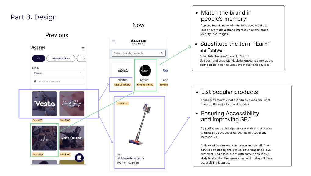
Improving Usability and Clarity:
The Merchant Directory Overhaul

This is a take home challenge I worked on for one of my interview 2023 for Accrue Saving. Accrue Saving is a financial platform that motivates users to save money for merchandise by getting rewards or setting up automatic deposits to their saving account. I want to share my thinking process that how I tackle the design challenge in 2 days.
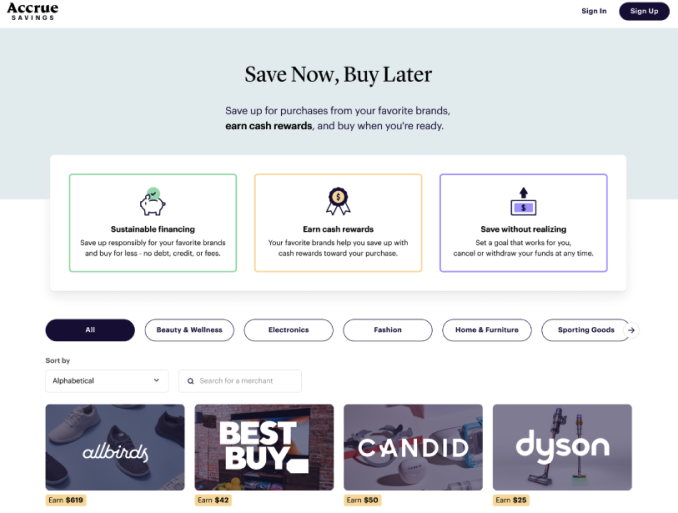
Given context

Thinking Process

To better understand the given context and better define the problems, I spend time on the website and given page to figure out their services and understand the content, I also reached out to one of my UX mentor to get her opinion. However,  I should’ve reached out to the company UX team to get the better clarification on the context.

Breaking Down the Given Context

- The Merchant Directory
The page introduces visitors to Accrue Savings, Help visitors select a merchant as their first step
- Upper funnel page and downstream page
User flow: the first page that user select a merchant, then next page is set savings goals and complete onboarding.
- Paid traffic
Visitors are primarily driven to this page via paid traffic. This implies users might be unfamiliar with Accrue Savings and need clear guidance.

Goal Analysis

- Improve Usability on Mobile
Considerations: Responsive design, touch-friendly elements, easy readability, minimalistic design.
- Better Explain Value Proposition / “How it works”
Considerations: Concise language, visual aids, step-by-step guide.
- Better Explain Unique Selling Point
Considerations: Highlight key differentiators prominently.
- Visual Clean-Up of Merchant Card
Considerations: Simplify design, use high-quality images, ensure consistent formatting.

Research

After clarify the context and goals, I had a series of research to identify the main problem.

1. Five second testing

In order to Understand the main problem of the merchant page and measure how well the design quickly communicates on the AccrueSaving-partners page, I implemented Five-second testing to gather qualitative feedback in a limited time to help optimize the design.

Success metric: more than 80% of participants would understand what service the company provides in 5sec browsing the website.

Task

Tell me about the product or service.
What is the purpose of the page?
Did the design/brand appear trustworthy?

2. Heuristic evaluation

I conducted a heuristic evaluation to identify the usability issue on the website to answer my question. And surprisingly, there are some usability issues merged.

“Why don’t people understand the company mission and service they offer?”

Result

Analysis the competitors

How does the other competitors provide their service?

Define

The research highlighted two primary issues: users did not understand what Accrue Savings offers the site had usability problems.The feedback indicated a need for clearer communication and more engaging content. Additionally, mobile usability improvements were necessary to enhance the user experience.

Sketches

I also use my pen and paper to get ideas out of my head with our bogged down with pixels and design system.

Brainstorming

Meanwhile I utilized my social network to get quick opinion of the tagline because the limit of time.

Solution

Reduce cognitive

I simplify and clarify the messaging to ensure users immediately understand the value proposition and unique selling points.

Mobile Usability

Also redesign the page with a mobile-first approach to ensure a seamless user experience on all devices

Takeaway

Overall biggest limitation is time. Really had to think about which moves and actions would most efficiently carry me towards my goal (skipped A/ B Testing for two solution I came up with )Reach out to design team to get more clarification.Would love to have more interviews with different groups to gain more quantitative data how help designer understand user’s pain points.More specifically if I had more time:What is the whole user flow looks like? I would conduct another usability test for whole website. I make some assumption that user might meet difficulties when they start planning their purchase.Do A/B Testing for the page layout to see which layout and term would be most efficient for user to find what they are interested in.

More...

I didn’t get this job offer, However I still ran up an A/B testing to see which design works better.

What's Next?

UX/UI Redesign

Enhancing E-Commerce Website For Better User Conversion

View the project

UX/UI Design

Provided a solution that let users fact-check news on their social media.

View the project